Traveler’s Tavern
App + Advertising
Project Type
Mobile App
Deliverables
App | Set of Illustrations | Print Ad Series
Overview
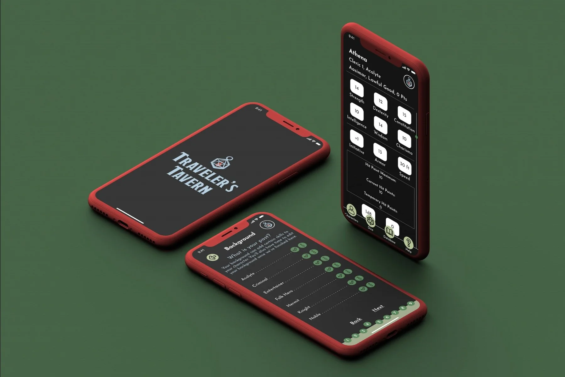
Traveler’s Tavern, originally known as Fifth Edition Character Sheet, is more than just an app, it’s an experience. Follow along and assists returners with their character-building. Traveler’s Tavern allows all players to create their character as quickly as possible, while also utilizing a database for information to avoid flipping through multiple player guides.
Solution
When I was creating Traveler’s Tavern, I thought out everything that I would want to see most when using a D&D app. As a fan of the classic Tabletop game, I used my own experience and the research of others to create a unique experience simplified to an app that you can’t find anywhere else on the app store.
The Problem
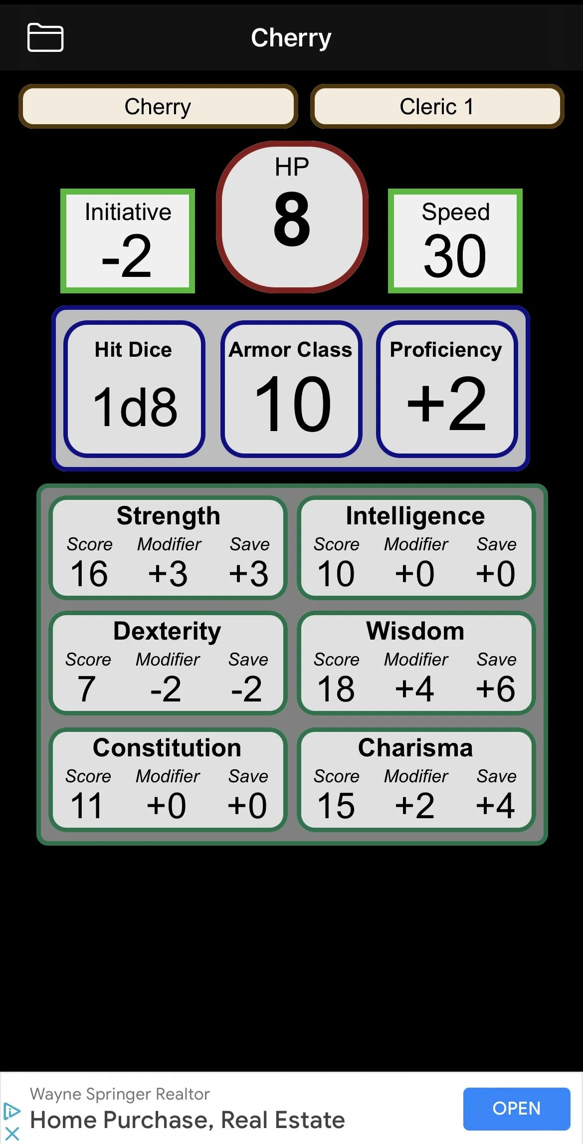
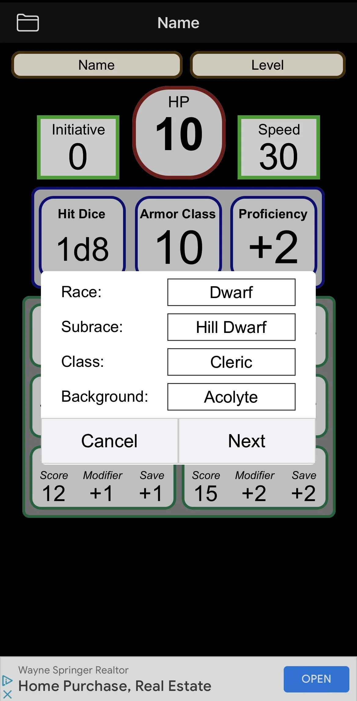
Fifth Edition Character Sheet, was as the uncreative name suggests. Just a character builder for a fifth edition version of Dungeons & Dragons. One of the reasons why I chose it though was the ability to customize a lot of the elements, and the wide array of choices. The main issue was the UI and the overall drab feel for it.
Original App Logo
Original App
The Research
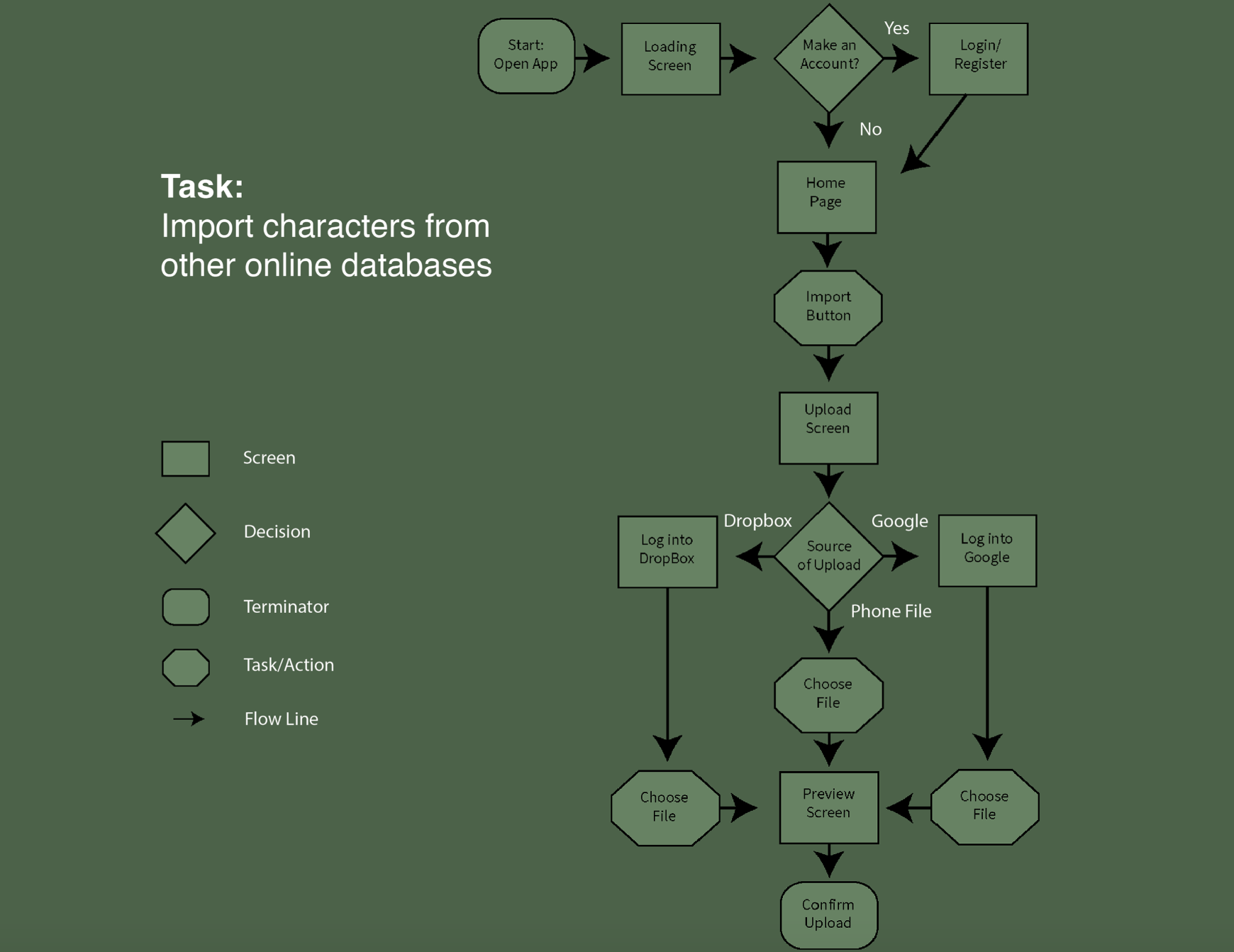
As this was one of my first major UI/UX projects, I needed to make sure that my data was all in line before I jumped in headfirst. I spent hours focusing on the sitemaps and user flows to best hone the way the app worked. I also spent time focusing on the target audience, however, it wasn’t difficult as the target audience was very similar to me and my friends. Using live studies and User testing was very useful when it got to the testing stages. And I didn’t just research Ui/UX during these times, I also tested if my data sources and information were enough for both beginners and experienced players. The audience for D&D is vast and wanted to make sure everyone could understand and find what they needed.
Site Map
User Flow
Creating the App
Traveler’s Tavern was made with the idea of being an experience, and not just an automated character sheet. Playing off of the “cliche tavern” theme that so many D&D campaigns use, I created a persona for the app called the Barkeep. Both new and old user can enjoy their fun dialogue, and feel a mysterious familiarity with their tone.
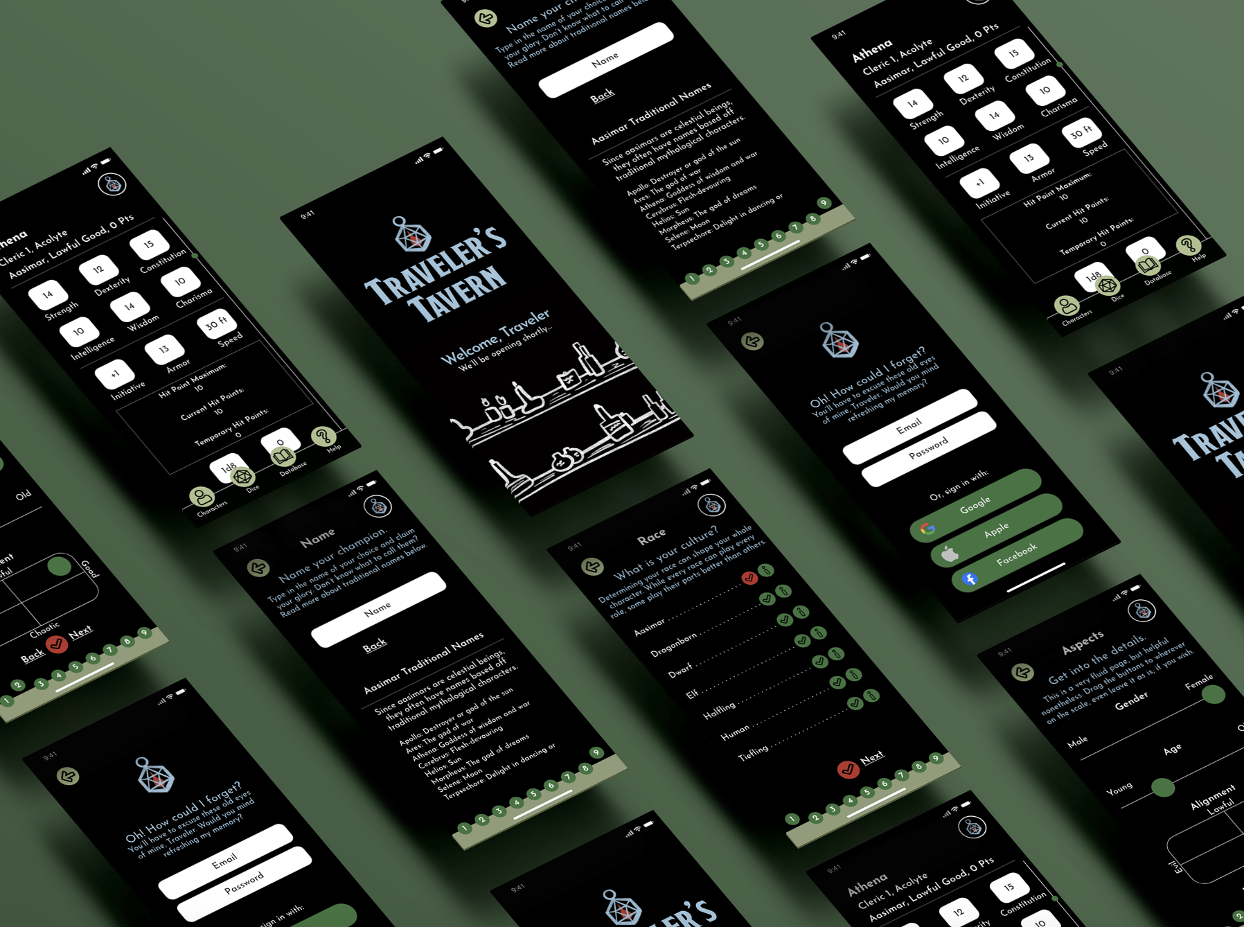
I also created my own illustrations and animations for splash and loading screens. Throughout the user flow, you can see different explanations on every race, character class, and so forth. If you already know what you want, it’s as quick as two taps and then you’re on to the next step. On top of the character creator, the user can utilize the navigation bar to access databases and a set of dice.
Final App
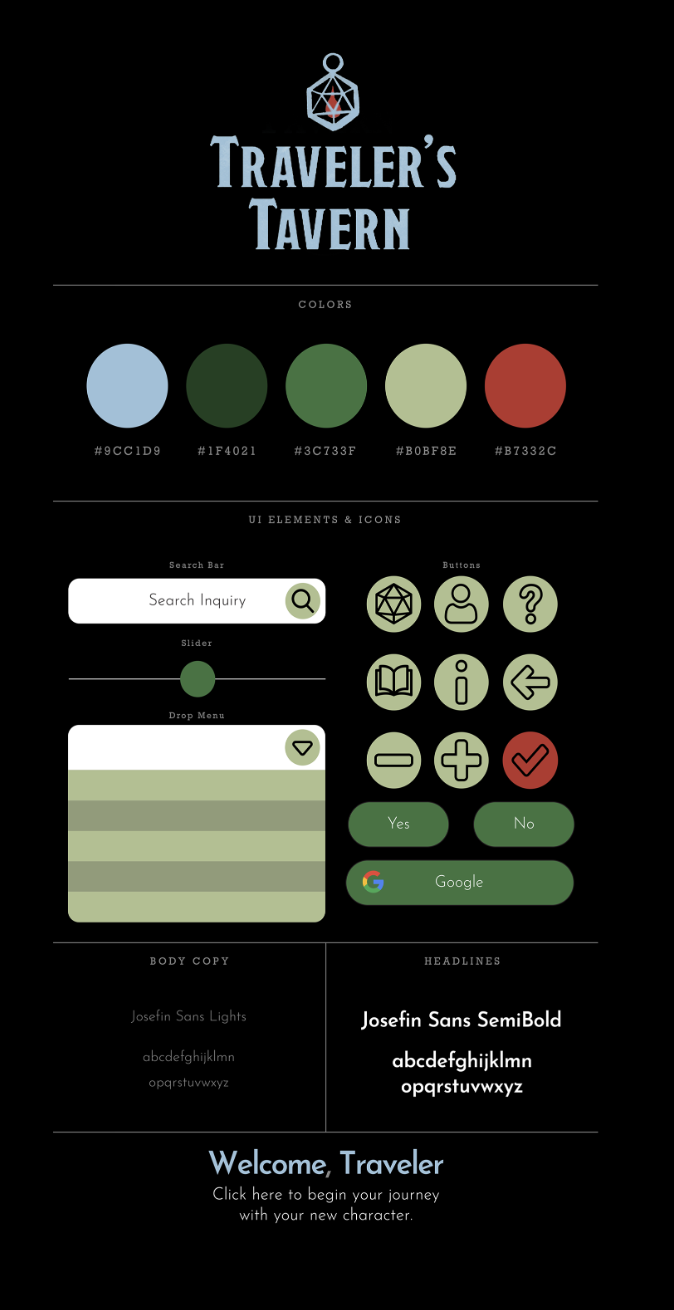
Brand Standards
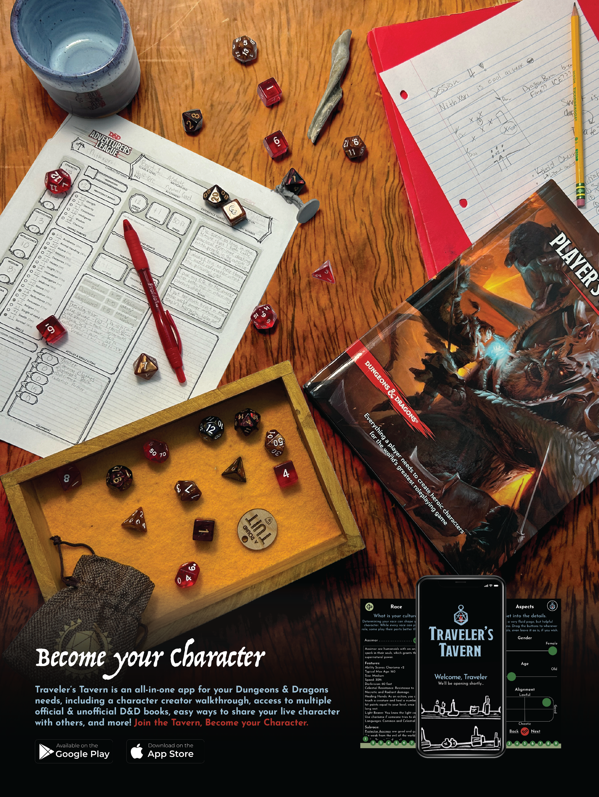
The Advertising
As rare as print is, I thought publication ads could best advertise the app itself. These ads help show an example of what a classic and standard game of D&D might look like from the player’s view. The first ad is targeted towards Dungeon Masters, or the people in the game who create the stories and who help move the players along. The second ad is targeted towards a general audience of players, and the last ad is used to focus on the fantasy/adventure of the game. Each ad contains a set of dice, some real notes from my own campaigns, and an official D&D Beyond book that pairs best with the scene. While I took these photos myself, I edited it best to create a cohesive yet unique atmosphere. These ads would be seen in publications such as Game Informers, Arcadia, and Dragon, which are mainly for gamers and those interested in D&D already.

